Field note
A Font Worth Keeping
A book contains enough examples of its own lettering to teach a computer how to print it again. Once I realised this, a typeface I liked became a project I could attempt with a phone camera.
The book was Milton and Cheadle’s The North-West Passage by Land, published in 1865. My copy reproduces the original text and typography. I wanted to use those letters on my blog: the fine strokes, the substantial serifs, and the slight unevenness that makes the printing feel alive.
The book itself was concerned with a much larger act of translation: making a distant landscape understandable to people who might never see it. Milton and Cheadle travelled across western North America in 1862–63, crossing the Rockies through Yellowhead Pass. Their account appeared two years before Confederation. Library and Archives Canada describes its contribution to Canada’s formation as indirect: it helped prepare public opinion in Britain and Canada for a federation that included the West.
Their preface argued for an overland route through British territory to the Pacific. This was a colonial vision of places where people already lived. The book records both a journey and some of the assumptions behind the country that followed.
I began by photographing pages. Whole pages supplied a range of characters; close-ups supplied the detail needed to reproduce them. That was the raw material. From there, Codex wrote and ran the code to turn the photographs into a working font.
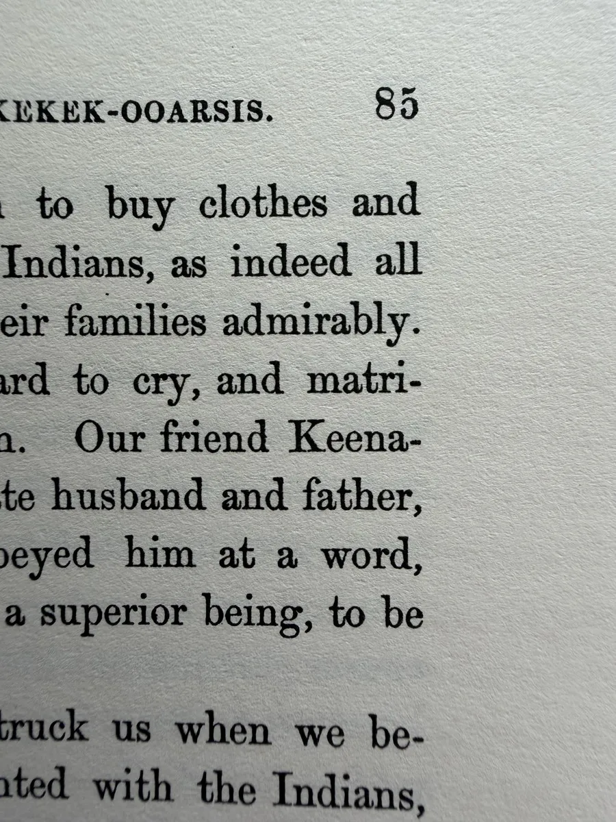 The surrounding letters matter too: they provide evidence of scale, alignment and spacing.
The first problem was finding the letters. A short Swift program used Apple’s Vision text recognition to read each image and locate words. Recognition supplied labels and positions. The actual shapes still had to come from the photographs.
Python code, using OpenCV, then separated ink from paper. Lighting varied across a page, so one fixed definition of “dark” would have been unreliable. The code made a heavily blurred version of the image as an estimate of the background brightness, then divided the original image by that estimate. This reduced broad shadows. After a little smoothing, a brightness cutoff produced a black-and-white mask of the ink.
Next came the surprisingly awkward question of what counted as one letter. The code found connected groups of dark pixels and sorted them from left to right within each word. Tiny groups could be discarded as noise. Groups overlapping horizontally could be combined, which helped reunite a dot with the stem beneath it. Quotation marks needed special handling because two separate ink shapes can represent one character.
When the number of extracted groups matched the recognised text, the code could associate a shape with a letter. When it didn’t, it skipped that candidate. Some awkward cases were isolated with explicitly chosen crops instead. This was a practical pipeline with exceptions, rather than a universal solution to reading old print.
Having many examples helped. The scripts gathered candidates, estimated their proportions from neighbouring letters, and favoured larger samples away from the page edges. Contact sheets made it possible to inspect several versions of the same character and choose a sound one. Each chosen letter retained a record of its source image and word.
Then pixels became geometry. OpenCV traced the outside of each ink shape and the boundaries of the holes inside it. The code simplified these contours into closed paths made of short straight segments. A B needs its two internal spaces preserved just as carefully as its outside edge. The result could be scaled without enlarging a photograph’s pixels.
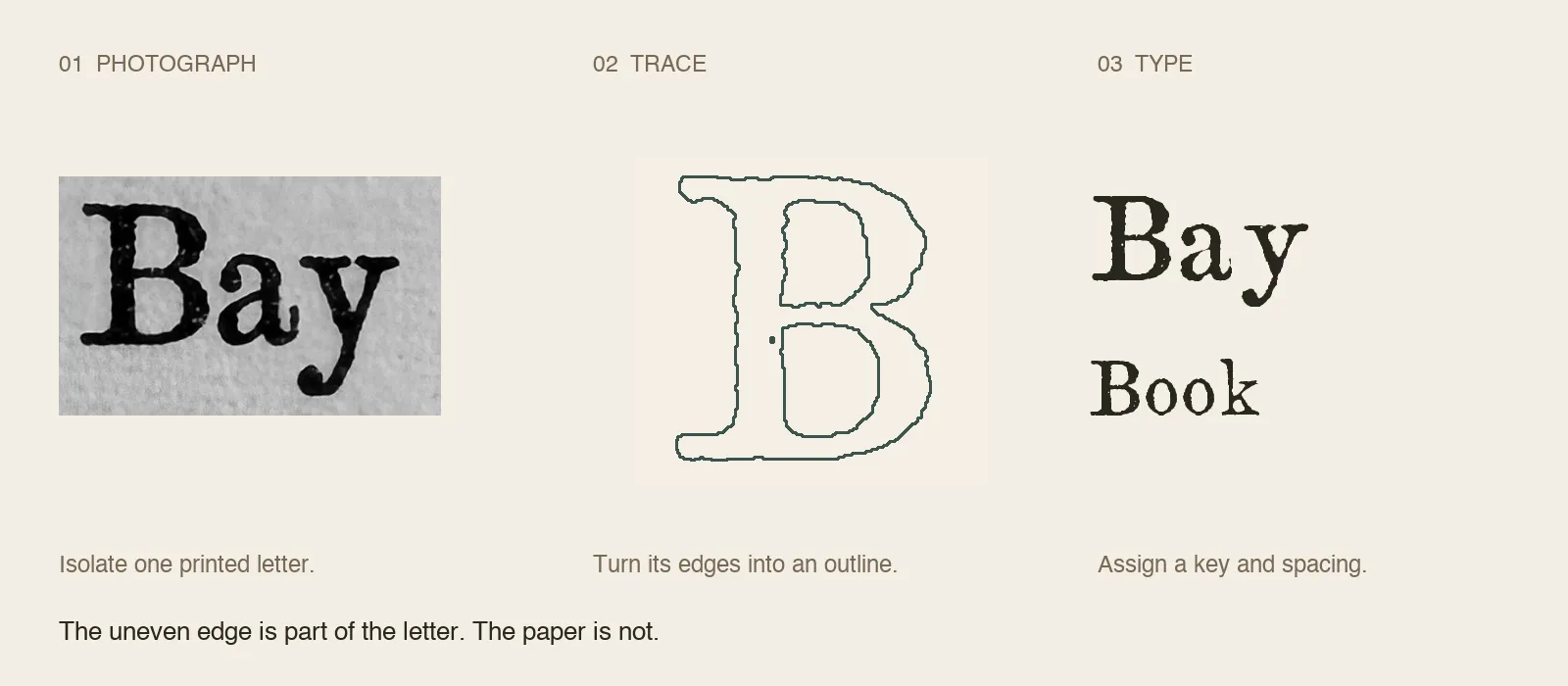 Photograph, outline, reusable letter. The paper disappears; selected irregularities in the ink edge remain.
Those outlines still needed a common coordinate system. A close-up letter might occupy twice as many pixels as one from a full page. The font used a 1,000-unit design scale, with ordinary lowercase bodies normalised to 460 units and most capitals to 680. Baseline positions, tall stems and descending strokes were assigned separately. Without this step, the alphabet would preserve the camera distances as faithfully as the lettering.
Spacing was another part of the design. Each character received a width and margins on either side. A small set of pair adjustments brought combinations such as “To” closer together. These were initial rules, still needing refinement, but they let separate drawings behave like words.
Finally, Python’s fontTools library assembled the outlines, spacing and character mappings into TrueType files. The mapping tells a program which drawing to use when it encounters a particular character. A compressed WOFF2 version made the same font usable on a website. Two amounts of smoothing produced the Printed and Softened treatments.
Review happened in sentences. A letter that looked convincing in isolation could appear weak, heavy or badly aligned beside its neighbours. A browser specimen made it easy to change the size, type new passages and display a sentence containing every letter in both cases. Weak characters could be replaced from better samples; proportions and spacing could be adjusted and the font rebuilt.
The result is Passage Study. It is still a prototype, and it doesn’t establish the name of the original typeface. But it does something a photograph cannot: it lets these particular shapes form sentences that never appeared in the book.
That was what I wanted. To take something I liked on a page and make it part of how I write.